 View on GitHub
 Install in Dash
StepperView
SwiftUI iOS component for Step Indications


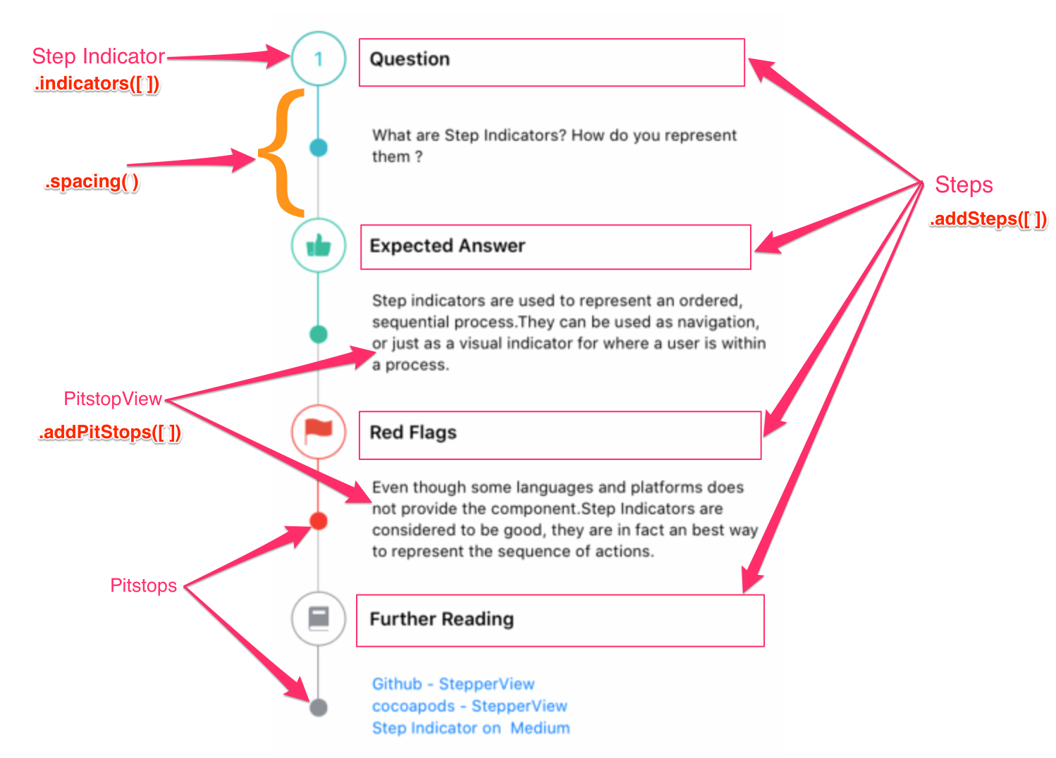
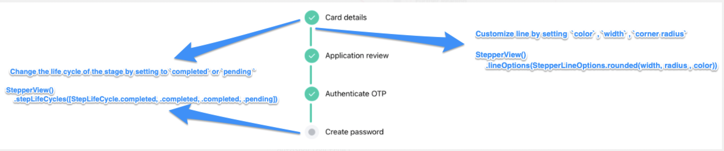
Table of Contents
- Features
- AI-Powered StepperView Generator
- Documentation
- Installation
- Requirements
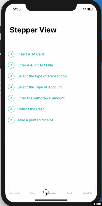
- Usecase
- Usage
- View Modifiers
- Custom Step Indicators
- Mentions
- Contribution
- License
Features
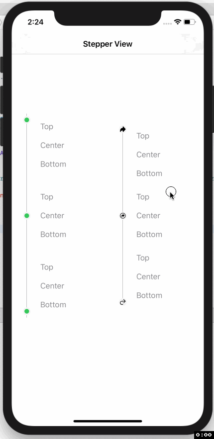
- Support for Vertical and Horizontal Alignments.
- iOS and WatchOS capabilities
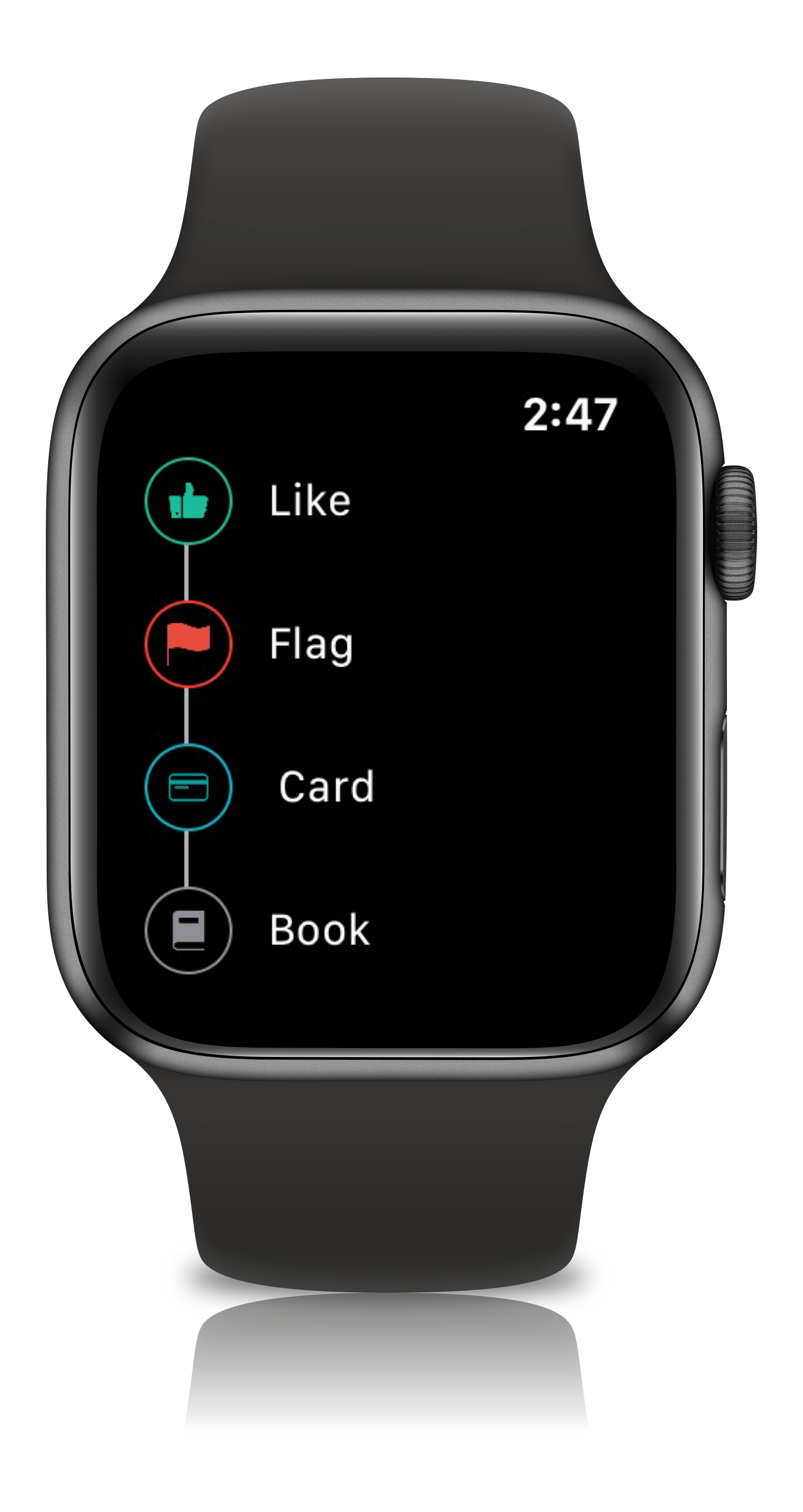
- Support for Circle, Image, Custom View, Animated Step Indicators
- Customizable line,spacing & animation options.
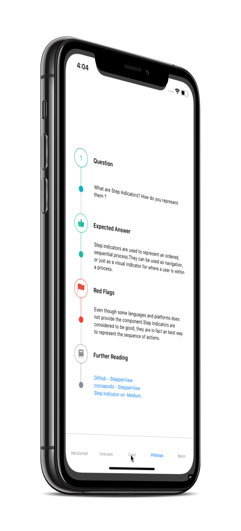
- Pitstop feature to add intermediate stages between Step Indicators
- Support for updating the life cycle status for each of the steps
- NEW: AI-Powered StepperView Generator using Apple’s on-device Foundation Models (iOS 26+)
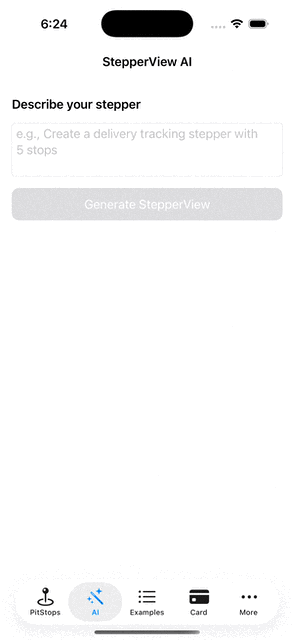
AI-Powered StepperView Generator
Generate fully configured StepperViews from natural language prompts using Apple’s on-device Foundation Models framework. Describe what you want in plain English, and the AI generates a complete StepperView with indicators, colors, pit stops, and lifecycle states — all rendered live with copyable Swift code.
Highlights
- Describe your stepper in natural language (e.g., “Create a delivery tracking stepper with 5 stops”)
- Supports vertical and horizontal modes
- Choose from numbered circles, plain circles, or SF Symbol indicators
- Use named colors or any hex color (e.g.,
#FF6B35) - Optionally add pit stops with descriptions
- Live preview and copyable Swift code in a tabbed interface
- Fully on-device — no network calls, powered by Apple Foundation Models
Quick Start
import StepperView

// Add to your SwiftUI view (iOS 26+ only)
if #available(iOS 26.0, *) {
    StepperViewAIGeneratorView()
}
Example Prompts
| Prompt | What it generates |
|---|---|
| “Create a 5-step checkout flow” | Vertical stepper with numbered circles |
| “Build a horizontal flight booking stepper with sfSymbol indicators” | Horizontal stepper with SF Symbol icons |
| “Make a recipe stepper in #E11D48 with details” | Vertical stepper with hex color and pit stops |
| “Create a 4-step onboarding flow in purple” | Vertical stepper with AI-chosen purple hex color |
Configuration
All AI generation behavior is configurable via ai_config.yaml — UI strings, default values, valid colors, SF Symbols allowlist, pit stop keywords, and the system prompt template can all be customized without touching Swift code.
Documentation
Installation
To run the example project, clone the repo, and run pod install from the Example directory first.
CocoaPods
StepperView is available through CocoaPods. To install it, simply add the following line to your Podfile.
pod 'StepperView','~> 2.0'
Carthage
Carthage is a decentralized dependency manager that builds your dependencies and provides you with binary frameworks. To integrate StepperView into your Xcode project using Carthage, specify it in your Cartfile:
github "badrinathvm/stepperView" == 2.0
Swift Package Manager
StepperView is available through Swift Package Manager.
In Xcode:
- Go to
File>Add Package Dependencies... - Enter the repository URL:
https://github.com/badrinathvm/StepperView.git - Select version
2.0or later
In Package.swift:
dependencies: [
    .package(url: "https://github.com/badrinathvm/StepperView.git", from: "2.0.0")
]
Requirements
- iOS 13.0+ (AI features require iOS 26.0+)
- watchOS 7.0+
- macOS 10.15+
- Xcode 16+
- Swift 5.9+
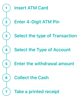
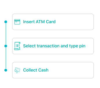
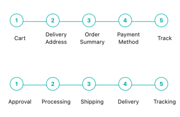
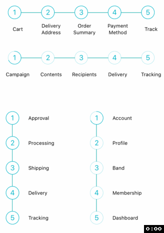
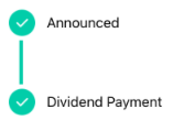
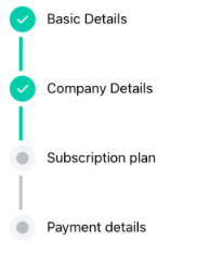
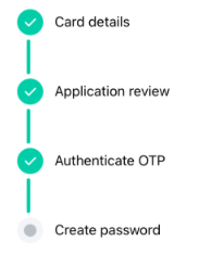
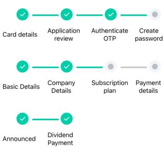
Usecase
 |
 |
 |
 |
 |
 |
 |
 |
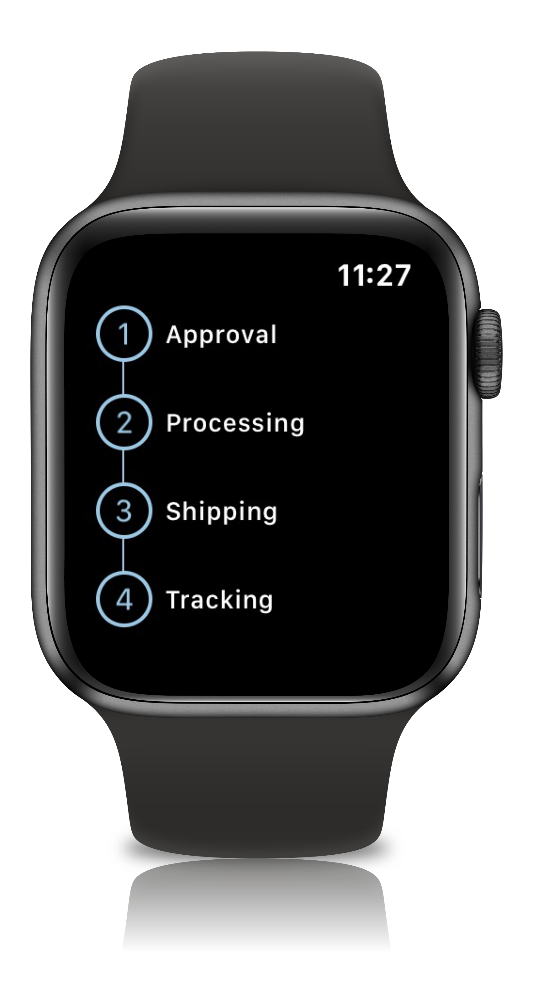
iPhone
 |
 |
 |
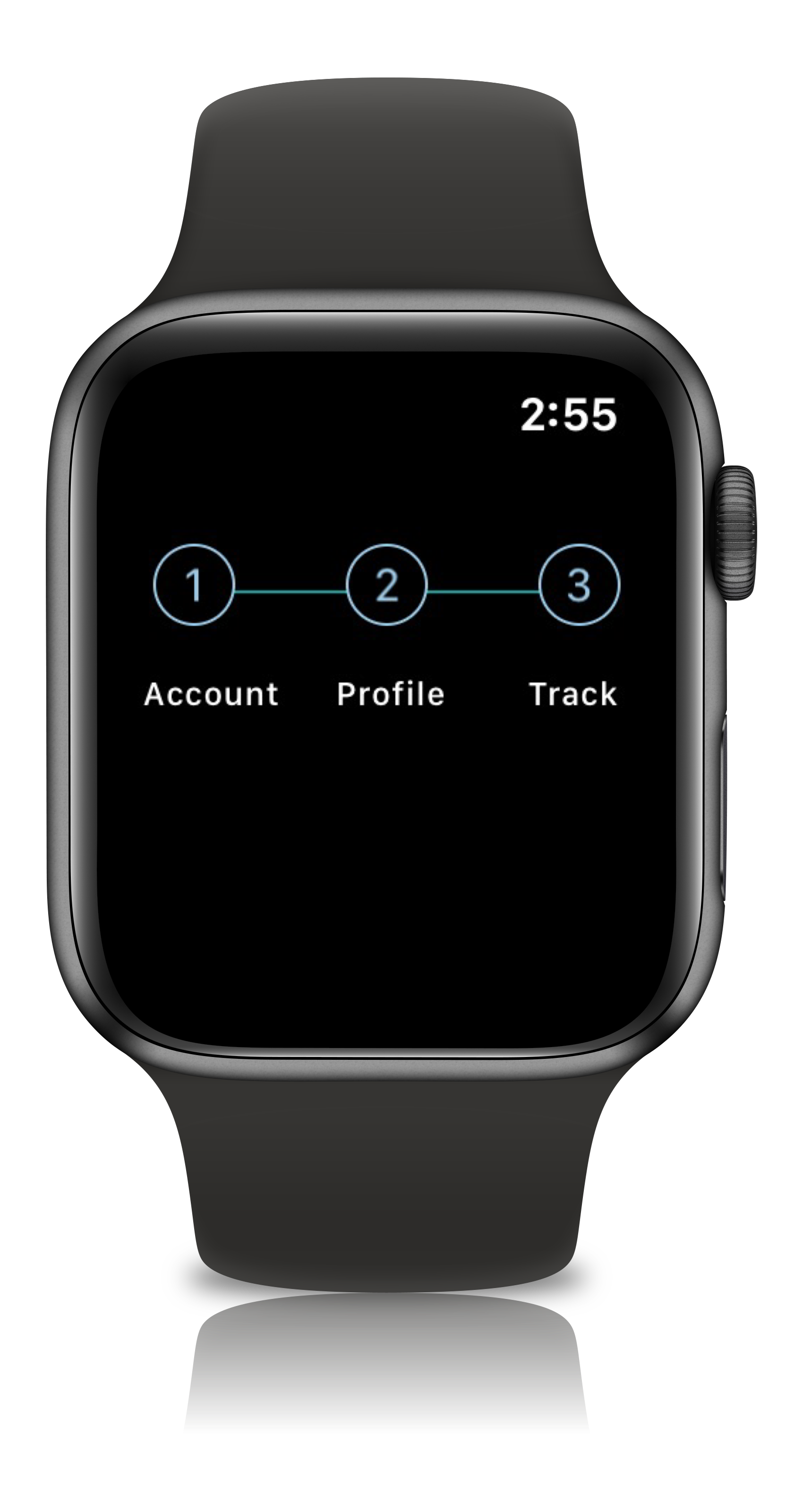
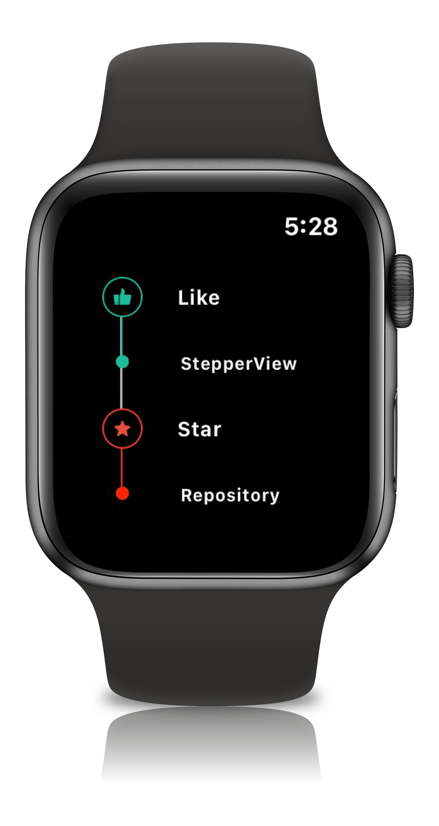
Apple Watch Support
 |
 |
 |
 |
View Modifiers
.addSteps(_ steps: [View]) :
          1. list of views to be closer to the indicator

.alignments(_ alignments: [StepperAlignment])
          1. optional modifier
          2. defaults to .center, available with custom options either .top, .center, .bottom

.indicatorTypes(_ indicators:[StepperIndicationType]):
          1. modifier to customize the step indications
          2. provides enum with cases .circle(color, width), .image(Image, width), .custom(AnyView), .animation(AnyView)

.lineOptions(_ options: StepperLineOptions):
          1. line customization `color` , `width` , `corner radius`
          2. Has the option of `defaults`, `custom` , `rounded`

.spacing(_ value: CGFloat):
          1. spacing between each of the step views either vertically or horizontally

.autoSpacing(_ value: Bool):
          1. if set to `true` - Dynamically calculates the spacing between each of the steps.

.stepIndicatorMode(_ mode: StepperMode):
          1. Step Indicator display modes either vertical or horizontal

.loadingAnimationTime(_ time: Double):
          1. controls the speed of the animation for step Indicator

.stepLifeCycles(_ lifecycle: [StepLifeCycle]):
          1. Can set the life cycle status for each of the steps as `completed`, `pending`

.addPitStops(_ steps: [View]):
          1. optional modifier
          2. list of views which will be displayed below the step text

.pitStopLineOptions(_ options: [StepperLineOptions])
          1. line customization `color` , `width` , `corner radius`

.stepperEdgeInsets(_ value: EdgeInsets)
         1. Provides custom `leading`, `trailing`, `top` & `bottom` spacing.
Usage
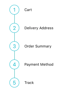
import StepperView

let steps = [ Text("Cart").font(.caption),
              Text("Delivery Address").font(.caption),
              Text("Order Summary").font(.caption),
              Text("Payment Method").font(.caption),
              Text("Track").font(.caption)]

let indicationTypes = [StepperIndicationType.custom(NumberedCircleView(text: "1")),
                        .custom(NumberedCircleView(text: "2")),
                        .custom(NumberedCircleView(text: "3")),
                        .custom(NumberedCircleView(text: "4")),
                        .custom(NumberedCircleView(text: "5"))]

var body: some View {
    StepperView()
        .addSteps(steps)
        .indicators(indicationTypes)
        .stepIndicatorMode(StepperMode.vertical)
        .spacing(30)
        .lineOptions(StepperLineOptions.custom(1, Colors.blue(.teal).rawValue))
}
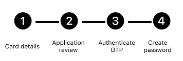
import StepperView

let steps = [
    TextView(text: "Card details", font: Font.system(size: 12, weight: Font.Weight.regular)),
    TextView(text: "Application review", font: Font.system(size: 12, weight: Font.Weight.regular)),
    TextView(text: "Authenticate OTP", font: Font.system(size: 12, weight: Font.Weight.regular)),
    TextView(text: "Create password", font: Font.system(size: 12, weight: Font.Weight.regular))
]

let indicators = [
    StepperIndicationType.custom(Image(systemName:"1.circle.fill").font(.largeTitle).eraseToAnyView()),
    StepperIndicationType.custom(Image(systemName:"2.circle.fill").font(.largeTitle).eraseToAnyView()),
    StepperIndicationType.custom(Image(systemName:"3.circle.fill").font(.largeTitle).eraseToAnyView()),
    StepperIndicationType.custom(Image(systemName:"4.circle.fill").font(.largeTitle).eraseToAnyView())
]

var body: some View {
    StepperView()
        .addSteps(steps)
        .indicators(indicators)
        .stepIndicatorMode(StepperMode.horizontal)
        .lineOptions(StepperLineOptions.rounded(4, 8, Color.black))
        .stepLifeCycles([StepLifeCycle.completed, .completed, .completed, .pending])
        .spacing(50)
}
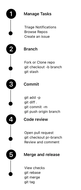
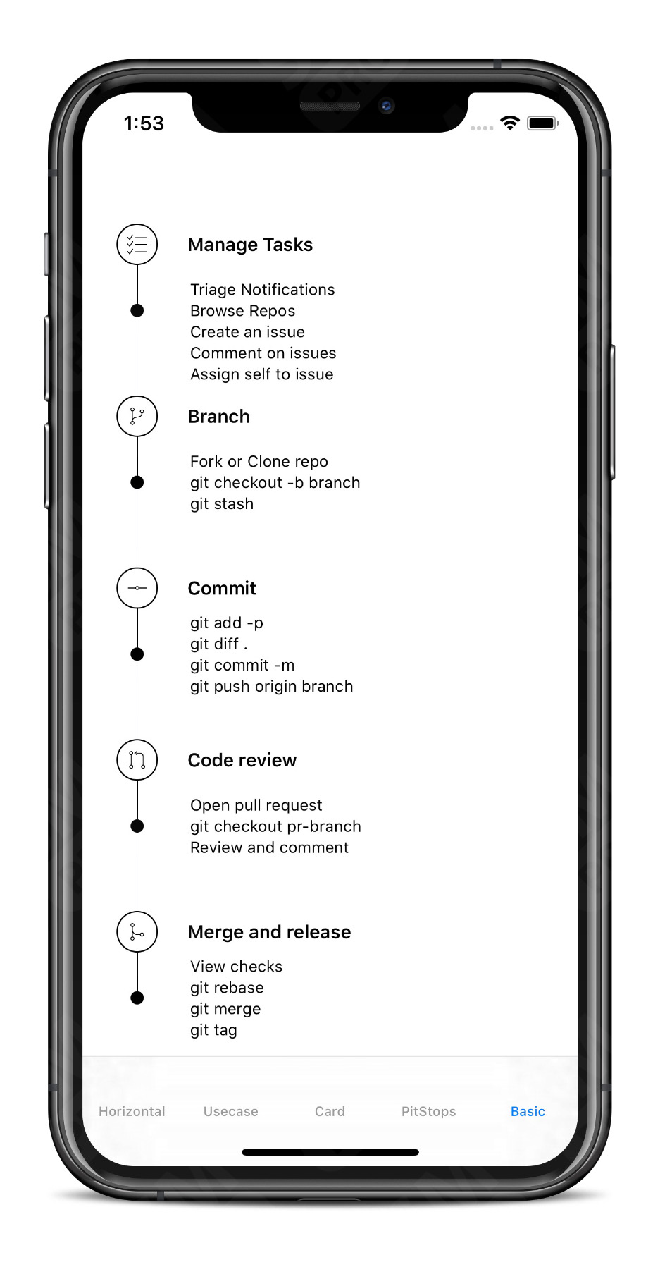
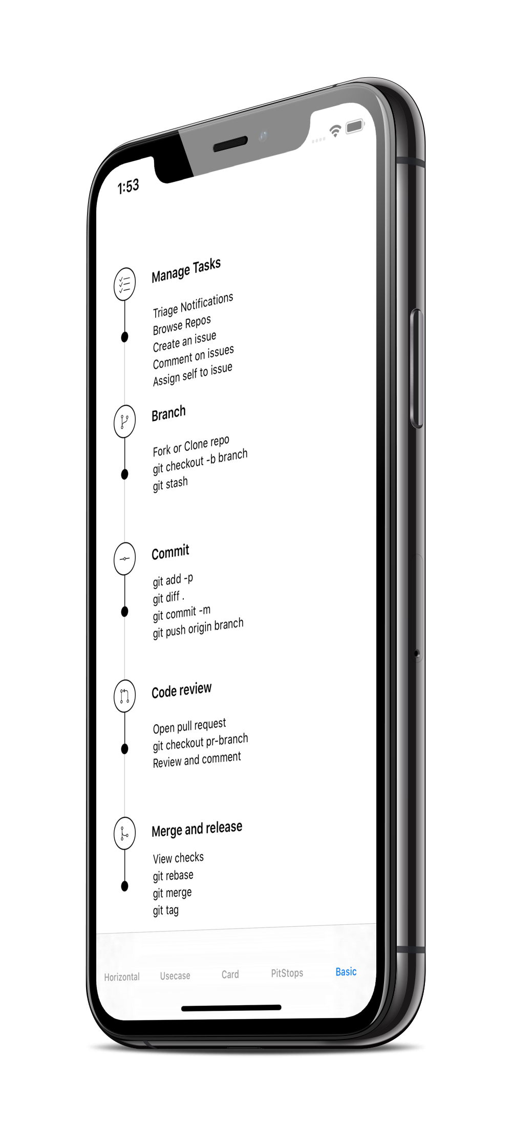
let steps = [TextView(text:"Manage Tasks", font: .system(size: 14, weight: .semibold)),
             TextView(text:"Branch", font: .system(size: 14, weight: .semibold)),
             TextView(text:"Commit", font: .system(size: 14, weight: .semibold)),
             TextView(text:"Code review", font: .system(size: 14, weight: .semibold)),
             TextView(text:"Merge and release", font: .system(size: 14, weight: .semibold))]

let indicators = [
    StepperIndicationType.custom(Image(systemName:"1.circle.fill").font(.largeTitle).eraseToAnyView()),
    StepperIndicationType.custom(Image(systemName:"2.circle.fill").font(.largeTitle).eraseToAnyView()),
    StepperIndicationType.custom(Image(systemName:"3.circle.fill").font(.largeTitle).eraseToAnyView()),
    StepperIndicationType.custom(Image(systemName:"4.circle.fill").font(.largeTitle).eraseToAnyView()),
    StepperIndicationType.custom(Image(systemName:"5.circle.fill").font(.largeTitle).eraseToAnyView())
]

let pitStopLineOptions = [
    StepperLineOptions.custom(1, Color.black),
    StepperLineOptions.custom(1, Color.black),
    StepperLineOptions.custom(1, Color.black),
    StepperLineOptions.custom(1, Color.black),
    StepperLineOptions.custom(1, Color.black)
]

let pitStops = [
    TextView(text:GithubPitstops.p1).eraseToAnyView(),
    TextView(text:GithubPitstops.p2).eraseToAnyView(),
    TextView(text:GithubPitstops.p3).eraseToAnyView(),
    TextView(text:GithubPitstops.p4).eraseToAnyView(),
    TextView(text:GithubPitstops.p5).eraseToAnyView()
]

var body: some View {
    StepperView()
        .addSteps(steps)
        .indicators(indicators)
        .addPitStops(pitStops)
        .pitStopLineOptions(pitStopLineOptions)
        .spacing(80) // auto calculates spacing between steps based on the content.
        .padding()
}

struct GithubPitstops {
    static var p1 = "Triage Notifications\nBrowse Repos\nCreate an issue"
    static var p2 = "Fork or Clone repo\ngit checkout -b branch\ngit stash"
    static var p3 = "git add -p\ngit diff .\ngit commit -m\ngit push origin branch"
    static var p4 = "Open pull request\ngit checkout pr-branch\nReview and comment"
    static var p5 = "View checks\ngit rebase\ngit merge\ngit tag"
}
Custom Step Indicators
NumberedCircleView
This view places the number or any text inside the circle.
NumberedCircleView(text: "1", width: 40)
CircledIconView
This view embeds an icon or image inside the circle.
CircledIconView(image: Image("flag"), width: 40, strokeColor: Color.red)
More Examples
 |
 |
 |
Mentions
SwiftUI Weekly #5
iOS Goodies #333
MBLT DEV DIGEST #302
Awesome iOS Newsletter #201
About-SwiftUI Articles
Better Programming - 6 Amazing SwiftUI Libraries
10 SwiftUI Libraries in 2021
Apps Using StepperView
Author
Badarinath Venkatnarayansetty.Follow and contact me on Twitter or LinkedIn

Contribution
Feature requests, bug reports, and pull requests are all welcome. Refer Contributing Guidelines for more details.
License
StepperView is available under the MIT license. See the LICENSE file for more info.